Skip to content
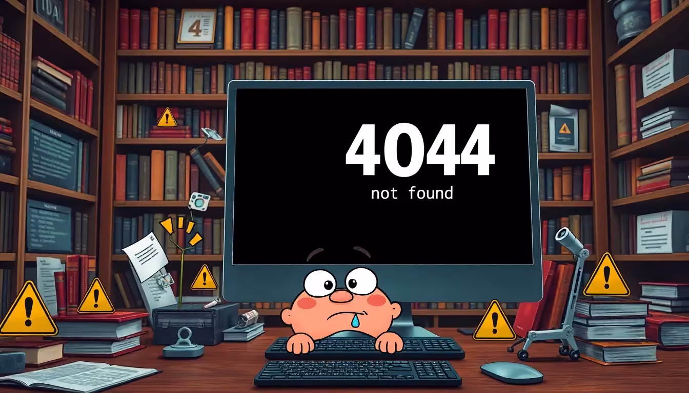
A custom 404 page transforms the moment of an error message into a clear brand message. Instead of losing users, it strengthens trust, user loyalty and even helps to noticeably increase the SEO ranking.
Key points
- Brand impact targeted use and building trust through individual design
- SEO advantages secure through well thought-out internal links
- Usability improve through simple navigation and search field
- Dwell time increase through relevant content and options for action
- Error management Understand as strategic optimization
Many website operators are not even aware of how important it can be to develop a clear concept for the 404 page as early as the planning phase. This is because it is not just about preventing user bounces: A well-thought-out 404 page can actively help to guide visitors' information and emotions at the crucial moment. Especially when users are "stranded" at a non-existent URL, they are usually somewhat irritated. A creative and at the same time helpful design can reduce tension and surprise positively. This turns a supposed error into an anchor point that points visitors in the right direction. In the long term, this not only strengthens customer loyalty, but also trust in the professionalism of a brand.
Why a custom 404 page is a must
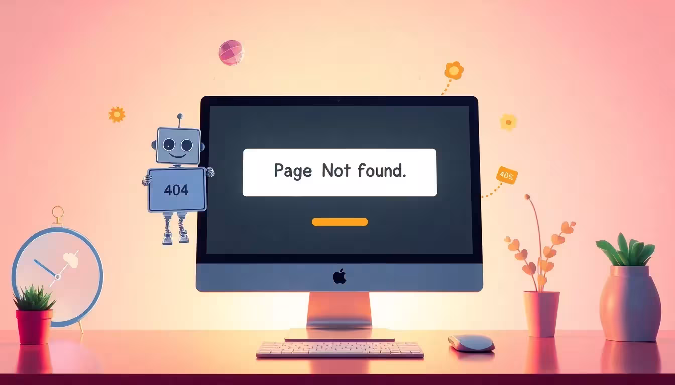
The standard error page is a digital standstill. A custom 404 page instead opens up new opportunities for interaction. Instead of frustration, it offers assistance; instead of a dead end, it offers strategic foresight. Users stay enthusiastically on the ball when they go directly to the home page, to current contents or be directed to important categories.
The situation can be charmingly defused with humorous texts or brand figures (mascots, sketches, animations). This not only prevents visitors from leaving - they even remember the experience. This has a stronger effect on digital brand identity than many other interface elements.
In addition, the 404 page is a window into your brand world: it allows you to communicate values in a very unobtrusive and creative way. Whether through witty sayings, interactive elements or small games - there are numerous ways to turn the moment of confusion into a positive brand experience. Users are often grateful for navigation or suggestions that get them "back on track". And it is precisely in these seconds that you demonstrate professionalism and a feel for user needs. Therefore, a well thought-out 404 page should never be dismissed as a minor project.
Implementing technology correctly - but with structure
An error message that does not display a 404 status code leads into the wrong SEO territory. For Google to recognize your page as a 404, it must provide the correct HTTP status code. It should also not contain an automatic redirect to the homepage. Instead, actively inform users about the error - ideally in everyday language.
Use the Header tag H1to include the focus keyword. "Oops, custom 404 page - page not found" is not only friendly, but also search engine friendly. This allows you to structure the page correctly, without detours or misunderstandings.
From a technical point of view, it is also advisable to check the 404 page regularly. Changes to the theme or plugin conflicts can unintentionally manipulate the status code. It is therefore advisable to regularly test whether the 404 code is being displayed correctly - for example by using an SEO tool or calling up a non-existent URL in your own browser. If you take a sloppy approach here, you risk duplicate content problems or confused search engine bots. A clean structure in combination with a clear, thematically appropriate H1 strengthens the website both technically and in terms of content.
Design elements that every custom 404 page needs
A successful 404 page should do more than just explain the error. It can become a direct part of the customer journey. The following elements help to retain visitors:
| Element | Function | SEO relevance |
|---|---|---|
| Internal links | Link to homepage, blog, store | Receive linkjuice |
| Search function | Enable direct content research | Increase dwell time |
| Brand-compliant design | Logo, typography, colors | Recognizability |
| Picture/Illustration | Sympathy and lightness | Emotional relevance |
| Call-to-action | "To home page", "Search now" | Increase interaction rate |
The combination of several of these elements is what makes a 404 page successful. Visitors want a clear explanation and a clear signpost. An appealing design that makes it immediately clear what went wrong works wonders. You should also include features such as a search function or links to popular posts. This will reduce the likelihood of users leaving the site immediately. Each of these components underlines your brand and makes it clear that you care about the user experience, even when mistakes are made. This results in a higher success rate, which keeps visitors on your site for longer.

WordPress and the custom 404 page: Simply implemented
In WordPress, you can create your own error page using the 404.php can be created directly in the theme. This gives you maximum control over design, structure and content. Plugins are ideal for beginners. These allow drag-and-drop functions, mobile optimization, redirects or even A/B tests.
A plugin with error logging is also useful. This allows you to recognize which URLs lead visitors to a dead end. Then you can take targeted 301 redirects set or restore content. This turns every error message into a direct optimization option.
If you want to delve deeper into the technology, you can use a child theme to ensure that updates do not overwrite your own 404 template. We also recommend taking a look at the "Permalink Settings" to avoid creating unwanted redirects. Plugins that have been specially developed for SEO often offer additional tools to collect or analyze error messages. Thanks to these evaluations, you can quickly see whether certain links lead to a 404 particularly frequently or whether a certain plugin is causing conflicts.
Performance should not be ignored either. An elaborately designed 404 page can delay the page load due to excessive scripts and images. You should therefore test whether the error page loads quickly. After all, users do not want to wait unnecessarily long for error messages.
More interaction - more SEO performance
The more effective your 404 page is designed, the lower your bounce rate. Visitors are invited to delve deeper into the website through structured links and clear language - sometimes even longer than originally planned.
In combination with good user guidance this ensures higher click paths per session. Google interprets this as a positive quality factor. This preserves your linkjuice and at the same time prevents potential site visitors from bouncing.

However, for this effect to really work, the 404 page should offer more than just a link to the homepage. Offer various alternatives, such as links to top categories or your most-read blog articles. This increases the chance that every user will find content that appeals to them. At this point, the integration of user-friendly design elements pays off twice over. Because intuitive navigation promotes engagement and trust.
Another aspect is the careful placement of CTA buttons. A prominently placed button with a clear call to action - "Start your search here" or "Discover our most popular products" - immediately directs the visitor to other pages instead of leaving them in no man's land of error messages. This keeps users active on the website, which in turn has a positive impact on SEO ranking and user satisfaction.
Common mistakes during implementation
Many site operators do not realize that their 404 page does not technically function as such. Especially with static pages, it often happens that the status code 200 is sent by mistake. This can lead to "duplicate content" problems and Google ranks the irrelevant error page the same as real content.
Another error: Automatic redirects without user information. Instead, make it clear why the link doesn't work. This is how the user appreciates your Transparency - and clicks on a new offer rather than the next provider.
It is just as problematic not to collect any additional data when errors occur. If you want to know why a 404 page is performing worse than expected, you should carry out regular log analyses. This is the only way to determine whether frequent typing errors in URLs are the cause or whether certain backlinks are orphaned. You can use these findings to adjust any spellings or correct misdirected links. This ensures that the 404 page is not overused in the long term and, above all, only appears in exceptional cases.
Design: As intuitive as possible, but with expressiveness
Colors, icons or visual effects should integrate seamlessly into the web design. Use the same fonts, imagery and design elements that are used on the homepage or subpages. The error page is not a special case - it is an elementary component of the digital interface.
A playful icon such as a broken light bulb, a robot with a question mark or a friendly drawing brings lightness. Users often stay a few seconds longer - just enough to trigger another click.
In order to ensure error-free display on all end devices, a responsive design have top priority. Regularly check whether all elements are arranged correctly on smartphones or tablets. Buttons that are too small or illegible font sizes unsettle users and can lead to bounces despite good content. Use flexible layouts and suitable white space to guide the viewer's eye. This keeps the page clear, even if you integrate additional information.
One last tip on design: Feel free to incorporate micro-animations or subtle hover effects. This not only increases the joy of interaction, but also draws the eye to relevant buttons (e.g. the search function). However, pay attention to technical fine-tuning: despite creative approaches, performance must not suffer.
Clever reuse of content
Static 404 pages waste valuable space. Instead, take the opportunity to present targeted content: new products, popular articles or current campaigns. This way, the error page doesn't just function as a return path - it becomes a strategic entry point.
Dynamic components can be used to automatically display suitable articles. For example, if someone uses a non-existent link to a lifestyle category, the 404 page can display suitable articles from this topic segment. This significantly reduces the bounce rate and promotes depth of use.

Another option is to integrate a chatbot that quickly asks what the user is looking for. In this way, contact details can be obtained or help articles recommended without being rigidly tied to a static page. Newsletter registrations or references to social media channels also often attract unexpected attention on a 404 page. A smart connection to your existing CMS can help you to keep the page constantly up to date. This will prevent your 404 page from appearing outdated or no longer making appropriate recommendations.
Of course, a certain degree of discretion should be maintained: The 404 page should not become a pure advertising platform, but should keep the actual added value for the user in focus. However, if a visitor has inadvertently accessed a broken page anyway, a sensible suggestion to subscribe to a newsletter or a link to a thematically relevant offer can be received positively.
Understanding the whole site as an opportunity
A custom 404 page rescues aborted sessions, extends the customer journey and strengthens the brand presence. It is an analysis tool, design platform and service point all in one. Those who ensure that visitors are redirected in a meaningful way in the event of an error remain significantly more relevant in the digital competition.
Instead of passively using a technical workaround, every website update should also include the 404 page. Its effect should not be underestimated: It offers relevance when everything else is not working - and that is exactly what users remember.
It is also helpful to obtain regular feedback. Analyze how long visitors stay on the 404 page on average and whether they switch to other subpages from there. A short questionnaire or an optional comment field could be informative as to which elements are well received and where further optimization potential lies dormant. This way you can find out directly from your visitors what they really expect when an error message appears.
In the long term, an individually designed 404 page can even become a small "unique position" on the web. Those who introduce unconventional ideas or stand out visually create stronger brand loyalty. Visitors are happy when their online experience remains consistent even in exceptional situations. By constantly developing your content and messages, you can turn a supposed dead end into a valuable junction in the user journey. This is exactly what creates a lasting impression - and clearly sets your website apart from the competition.