Skip to content
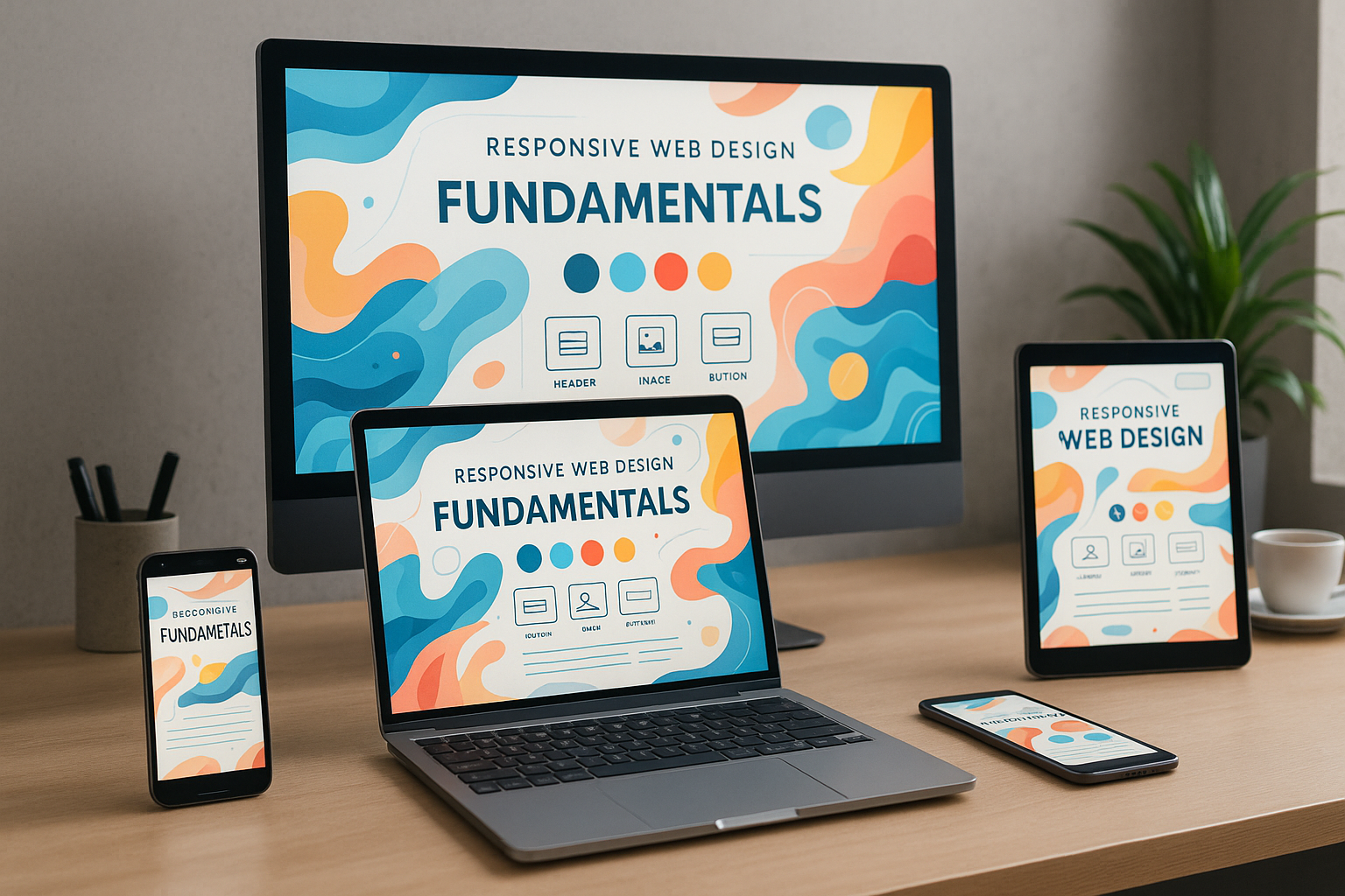
Responsive web design forms the basis of modern web development. It ensures that content is displayed reliably on every end device - whether smartphone, tablet or desktop. This guide shows the most important principles, technologies and procedures for creating flexible websites according to current standards.
Key points
- Mobile-FirstStart with the smallest screen format for better performance and usability.
- Flexible layoutsAvoid rigid pixel values and work with relative units.
- Media QueriesUse breakpoints for device classes such as smartphones or large monitors.
- Customize imagesOptimize media content for different resolutions and bandwidths.
- TestingCheck the display on real devices and with simulation tools.

What makes responsive web design?
With responsive web design Layout and content automatically adapts to the size and resolution of the device being used. This keeps user navigation intuitive and content clearly structured - whether in portrait or landscape format. I do not use separate mobile versions, but create a single flexible design. The prerequisite is a modular structure and well thought-out design. The aim is always to ensure full functionality and readability on every type of device.
Technical basics: HTML, CSS and JavaScript
The basis of every responsive website is HTML for the structure, CSS for the layout and JavaScript for dynamic content. While HTML organizes semantically, I use CSS to define rules for size, spacing, colors and positioning. JavaScript comes into play when content needs to be interactive or dynamic, for example with drop-down menus or lazy loading of images.
Use breakpoints and media queries sensibly
Media queries enable a targeted adaptation of the design to screen sizes. I use so-called Breakpoints from typical device dimensions such as 576px, 768px and 1200px. This gives a navigation menu a drop-down format on mobile devices, for example, while it remains fully visible on the desktop. Fine-tuning via media queries allows me to change layouts without having to write additional code for each device.
Mobile First: Efficient and logically structured
The mobile-first principle always starts the design with the smallest format - usually a smartphone. I design larger layouts based on this with min-width queries. This technique reduces loading times because unnecessary styles or images are not even loaded on smaller devices. Anyone looking for proven strategies for mobile-friendly design can take a look at this Guide to mobile optimization Orientation.

Targeted responsive integration of images and media
A common mistake when designing responsive pages is to use fixed-size images. Instead, I use a mixture of max-width and srcsetto adapt images to different display sizes and bandwidths. Modern formats such as WebP offer additional loading time advantages. In this Article about responsive images you will find further optimizing best practices.
CSS techniques: Grid, flexbox and units
When arranging the page elements, I prefer to work with CSS Grid or Flexbox. While Flexbox is ideal for row and column structures, CSS Grid allows extensive 2D layouts. Instead of fixed pixel specifications, I use Percentage units or viewport-scaling units of measurement such as vw and vh. As a result, scrollbars disappear on mobile devices and content flows smoothly.

Step-by-step to a responsive site
A well-functioning structure begins with analysis: I determine which device types are primarily used. From this, I derive a sensible page structure and define logical Navigation elements. I then build the basic layout with CSS Grid and use breakpoints in a targeted manner. I then adapt the media content and check the behavior on real devices. I take performance and loading times into account right from the start.
Table: Overview of frequently used breakpoints
| Breakpoint | Target device | Example devices |
|---|---|---|
| up to 576px | Smaller smartphones | iPhone SE, Galaxy A01 |
| 577-767px | Large smartphones | Pixel 7, iPhone 14 |
| 768-991px | Tablets | iPad Mini, Galaxy Tab |
| 992-1199px | Laptops | MacBook Air, Surface Pro |
| from 1200px | Large screens | iMac, 4K displays |
Avoid typical implementation errors
Layouts that are too rigid do not work reliably on tablets or mobile devices. Buttons that are too small for the finger also do not offer a good Interaction. That's why I consistently avoid fixed widths or absolute font sizes. I plan simple navigation with a maximum of two levels and check everything regularly on smartphones, tablets and desktops. Tools such as Responsive Mode in Browser DevTools help with this.

CMS and hosting: the basis for fast sites
WordPress is ideal for responsive websites as it offers hundreds of modern themes that meet mobile standards. Hosting solutions with SSD storage and caching technologies are particularly recommended. Convincing in tests this hosting provider with fast loading time and simple CMS integration - ideal for the implementation of flexible web projects.
Another important point is the regular updating of the CMS and its plugins. Missing updates can not only cause security vulnerabilities, but also lead to responsive functions no longer working properly. I therefore make sure that I always use the latest WordPress version and update themes and plugins promptly. Especially with responsive behavior, small adjustments or quickly installed updates often make the difference between optimal display and annoying layout errors. Those who value a high degree of flexibility benefit from constantly evolving editor functions that simplify the mobile structure of a website.

Ensuring accessibility for all users
When using responsive technologies, the Accessibility (accessibility) plays a central role. I make sure that the content is not only usable on different screen sizes, but also under different technical conditions. For example, screen readers should read out all important information without errors, which is achieved through correct HTML markup and meaningful ARIA attributes. In addition, fonts and contrasts should be chosen in such a way that good readability for people with visual impairments is guaranteed. Responsive design and accessibility can be perfectly combined - I therefore recommend taking the basics of the WCAG standards into account right from the design stage in order to offer all users an optimal experience.
Progressive enhancement: gradual build-up
The practice of Progressive enhancement focuses on making a website usable for the simplest devices or browser versions first and only adding more complex functions in a second step. This means that a page remains usable even if JavaScript is deactivated or the internet connection is unstable. For responsive web design, this means initially focusing strongly on the basic layout and content structure. Later, an extended version of the layout is provided with CSS Grid, Flexbox or dynamic JavaScript functions as soon as the device or browser environment allows this. This increases both compatibility and performance.
Performance optimization with caching and compression
Especially with responsive websites, a comprehensive Performance optimization. I compress CSS and JavaScript files to minimize the number of HTTP requests. A clever caching strategy (e.g. server-side and client-side caching) also significantly reduces loading times, as returning visitors do not have to reload every website element. We also recommend the use of Content Delivery Networks (CDNs) for static resources such as images, stylesheets or scripts. This distributes the load more evenly and the user receives the data from a data center close to them. With the help of GZIP or Brotli compression, the files can also be significantly reduced in size, which increases user-friendliness, especially on mobile devices.
SEO relevance of responsive websites
Rate search engines like Google Responsive web design positive, as it improves user-friendliness and eliminates duplicate content through separate mobile versions. So I benefit twice: on the one hand, I ensure a better user experience, which has a positive effect on the ranking. Secondly, there are no multiple addresses for the same website, which keeps the authority (link juice) bundled. Google also recognizes when pages are optimized for mobile devices and rewards this with a better ranking in mobile searches. Last but not least, responsive design makes it possible to implement consistent internal linking, which makes indexing easier for search engines.
Frameworks and best practices
To simplify recurring tasks in responsive design, I sometimes use frameworks such as Bootstrap or Tailwind CSS. They provide predefined grid systems, components and utility classes that save time and effort. However, I always keep in mind that additional frameworks can make the code more extensive and potentially more complex. A lean alternative is to adopt only individual modules or ideas from them instead of integrating a complete framework. This keeps the website lightweight and fast. Best practices also include removing superfluous code, choosing minimalist class names and only including elements that are really needed - a lean CSS ensures better loading times and code that is easier to maintain.
Beta tests and user feedback
Before I go live with a responsive website Beta tests indispensable. To do this, I am looking for a diverse group of testers who use different devices, operating systems and browsers. This allows me to quickly recognize whether input errors are creeping in or whether parts of the page are not displayed correctly on certain devices. Tester feedback helps me to refine the layout and content as required. Even after going live, I regularly check user behavior with the help of web analysis tools: Click paths, bounce rate and length of stay allow conclusions to be drawn about possible optimization points. For example, a fluid design can get stuck with unusual screen formats, which should be adjusted in later updates. In this way, I always keep the website up to date and ensure the best possible user experience.
Preparation for future standards
Web technologies are developing rapidly - and so are the requirements for responsive web design. New device categories such as wearables or smart TVs regularly present developers with challenges. That's why I always plan with future-proof techniques and keep the code modular so that it can be expanded quickly if required. Media queries can already be adapted not only to screen widths, but also to resolutions or interaction methods (touch, mouse pointer, voice control). If you remain flexible and keep investing in new technologies, you will save yourself costly complete relaunches. Progressive HTML and CSS specifications in particular, with features such as container queries or subgrids, enable more dynamic layouts that react even better to different display variants.
Valuable analyses for fine-tuning
The long-term goal of a responsive project is an ongoing Optimization. For this I use tools like Google Lighthouse or WebPageTest to check the loading speed and performance on mobile devices. Heatmap tools can also show which areas of a page are clicked on most frequently. Findings from these analyses are used for fine-tuning, for example by moving important buttons to the visible area or further optimizing images. Continuous improvement ensures satisfied users and boosts the conversion rate at the same time. Those who pay particular attention to performance therefore win twice over: both in terms of user-friendliness and ranking in the search results.
Summarized
Those who make targeted use of responsive web design save maintenance time, ensure consistent usability and create a sustainable online presence. Instead of managing rigid layouts, I prefer to invest in a flexible structure that can be adapted to any screen size. With well thought-out planning, media queries and optimized images, you can build modern websites that are impressive on all devices. Responsive design is no longer an extra - it's a matter of course.