Skip to content
Dark Mode Hosting takes the operation of hosting control panels to a quieter, more energy-efficient level and noticeably reduces eye strain during long admin sessions. I'll show you how the mode Usability Strengthens, extends battery life, and increases accessibility—including practical implementation tips.
Key points
I will first summarize the most important aspects so that you can specifically classify the advantages and implementation steps. My statements are based on practical experience and proven effects from ergonomic working and display technology [1][2][3][4][5][6][7]. The focus is on energy issues, reading quality, and panel controls. I also make conscious decisions about maintenance and testing so that there are no surprises during operation. I will briefly summarize the core topics:
- ergonomicsLess glare, more relaxed eyes, focused work [1][2][3][4][6][7].
- AccessibilityHigh-contrast display, helpful for light sensitivity and migraines [3][4][5][7].
- Efficiency: Noticeable energy savings on OLED/AMOLED, longer battery life [1][2][3][6].
- Integration: Plugin path or CSS/JS toggle, OS sync, and time control [1][2][5].
- Maintenance: Contrast checks, icon adjustments, testing on many devices [6].
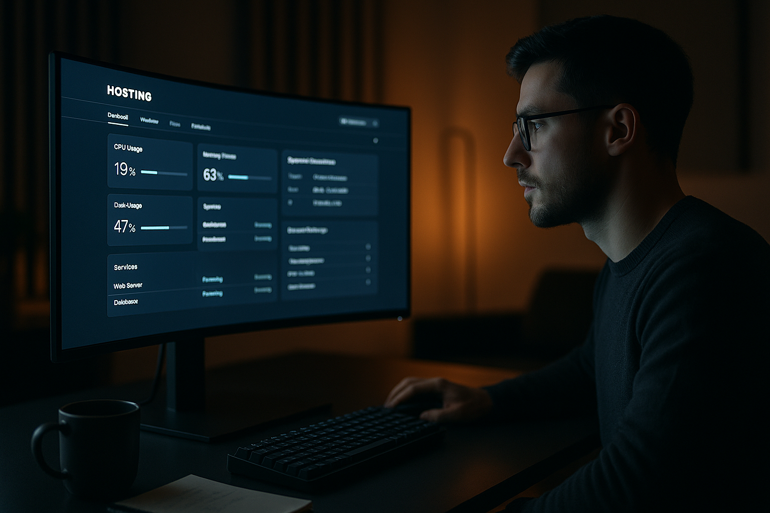
Why dark mode matters in the hosting control panel
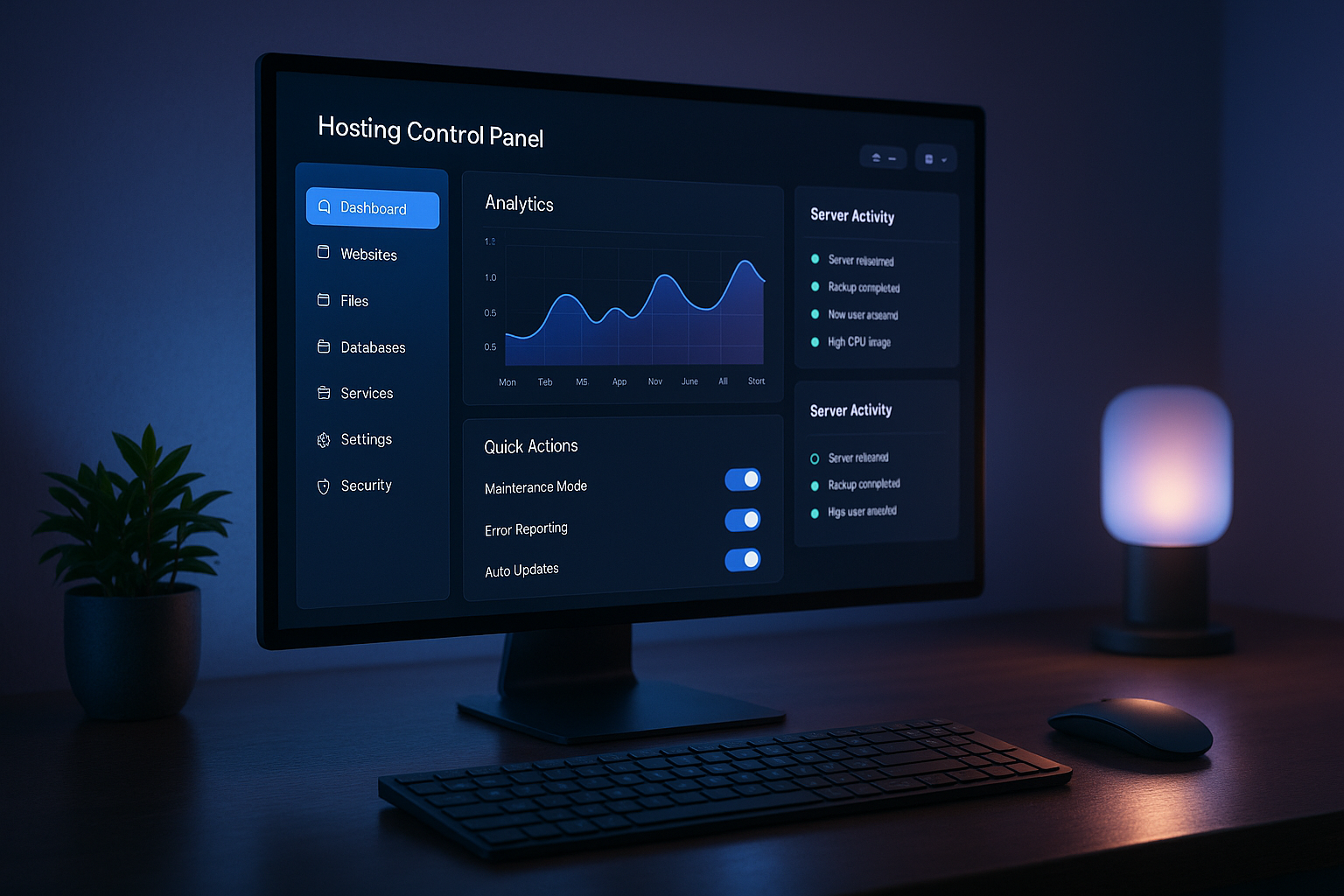
Many administrators work for hours in the panel, so a dark mode the visual strain is significant. Especially in darkened environments, a bright UI is very distracting and disrupts the workflow, while dark schemes keep the eye movement calmer. I rely on low luminance, moderate contrast, and a clear highlight color for states such as successes, warnings, and errors. In addition, I am supported by a user-centered dashboard, which arranges functions logically and reduces friction. This keeps the Usability consistent, regardless of whether the panel is running in light or dark mode.
Energy savings on OLED and AMOLED
On modern OLED and AMOLED displays, dark pixels consume less power because they are partially turned off [1][2][3][6]. In practice, this extends the battery life of laptops and smartphones, which makes mobile admin work easier without a power outlet. I also pay attention to economical colors, avoid large areas of pure white in the dark theme, and rely on vector graphics with lean code. This approach saves energy and makes the panel faster at the same time. The ecological effect grows when I combine efficiency with a green data center connect, thereby connecting the entire Sustainability increases.

Accessibility and readability
A good dark theme increases the Readability for people with visual impairments, migraines, or light sensitivity [3][4][5][7]. I choose contrasts carefully: dark gray instead of deep black and light, not bright gray for text. I use color accents sparingly so that status colors such as red, yellow, and green are clear. I scale font sizes and spacing so that long tables, logs, and diagrams remain comfortable to read even after hours of work. It is also important that focus rings, keyboard controls, and screen reader attributes work just as well in the dark scheme.
Implementation: Plugins or custom CSS/JS
Plugin themes with admin toggle, time control, or OS sync are often sufficient for a quick start [1]. If you want more control, add a .dark-modeclass in the stylesheet and activate it using a switch or media query. I then check all UI elements: table lines, badges, buttons, tooltips, and charts. I keep icons and logos transparent and contrast-resistant so that they do not fade on a dark background. For smooth operation, I link the switch with Automation and UI integration, so that user profiles reliably retain their preferred display settings.
Design systems: colors, contrast, typography
I define color tokens for background, surfaces, text, lines, and status colors so that the Design system remains consistent. Light and dark modes share the same semantic names, only the values change. This reduces maintenance effort and minimizes errors. I set a clear hierarchy for text sizes: titles, sections, table headers, cells, microcopy. This order makes it easier to navigate and keeps the visual load low during long sessions.
Performance and loading time in dark mode
A dark theme may not Performance That's why I organize styles in a modular way, reduce duplicates, and use system-related features such as prefers-color-scheme when the setup allows it. I optimize images with modern formats and specifically use CSS colors instead of heavy textures. I render critical elements such as charts or code viewers efficiently to keep the UI fluid. This allows dark mode to blend into the panel without any clutter.

Testing, telemetry, and maintenance
Before I release the theme, I carefully test contrasts, focus states, keyboard operation, and screen reader flows. This includes various displays, resolutions, and brightness levels to ensure that the Quality everywhere. I collect feedback in a structured way, for example via short in-panel questions. A/B tests show how users interact with the switch and whether the dwell time increases [5]. During operation, I keep a checklist handy to ensure that icons, diagrams, and new features are always suitable for both modes.
Safety and error prevention
Critical warnings must be clearly recognizable in the dark scheme without being dazzling. I therefore use rich, but not garish, colors. status colors, I differentiate between warnings, errors, and successes, and keep reading texts clear. Icons are given clear contours so that they do not blur on gray surfaces. For logs and terminal views, I prefer monospace fonts with sufficient line spacing. This ensures that messages and metrics remain reliably legible even at night.
Provider comparison: Dark mode in the control panel
If you want to make a quick decision, check how flexible a provider is with dark mode in control panel Relevant factors include switching options per user, OS synchronization, contrast quality, and the optimization of icons and diagrams. I also consider how efficiently the theme uses OLED panels and whether battery life is demonstrably improved. The following table provides a compact overview of three typical setups. This classification can be used to derive priorities for selection and rollout.
| Place | Provider | Dark mode available | user customization | Energy efficiency | Recommendation |
|---|---|---|---|---|---|
| 1 | webhoster.de | Yes | highly flexible | optimal (OLED) | Test winner |
| 2 | Provider B | Yes | medium | good | – |
| 3 | Provider C | Partial. | low | low | – |
I find it particularly positive when a provider offers switches for group rights and consistently optimizes visual building blocks for dark surfaces. This way, beginners and teams alike benefit from Flexibility, runtime advantages, and smooth display.
Implementation steps for administrators
First, I check the current UI, list critical elements, and define color tokens for dark mode. Then I activate a Toggle in the profile or panel header and save the selection in the user context. Third, I check contrasts and focus display, including keyboard controls and screen reader labels. Then I adjust icons, logos, and chart colors to dark backgrounds and test them on different displays. Finally, I roll out the mode in stages, collect feedback, and quickly implement minor corrections.
Technical architecture: tokens, variables, and layers
To ensure that dark mode remains robust during operation, I structure colors and spacing as semantic tokens (e.g., bg/surface, text/primary, text/muted, border/subtle, state/success). I map these to CSS variables, which I overwrite for each mode. This allows me to change the color system without a flood of selectors and avoid duplicates. For larger panels, layering using cascade layersBasic typography, components, utilities. Conflicts become less frequent because priorities are clear. If the system operating system specifies dark or light mode, I can use prefers-color-scheme Configure automatically and treat the user toggle as the highest authority.
At the component level, I consider the styles condition-basedHover, focus, disabled, error, and success each receive their own tokens. This ensures that switches, form fields, and tables remain recognizable even at high density. For drop shadows, I prefer to use subtle, lightly colored outlines in the dark, because classic shadows have little effect or become blurred on dark backgrounds.
State management and avoidance of FOUC
A common stumbling block is the FOUC (Flash of Unstyled/Incorrect Color) when the panel flashes briefly. I therefore set a small inline logic early in the head: The last selected mode is read from the user profile, cookie, or localStorage and applied as a class to html written before the stylesheet loads. Server-side preferences prevent inconsistencies between devices. Optionally, I only override the OS mode if the user has made a conscious choice—this makes the behavior feel natural.
For the switch itself, without reloading the page Ideal: I add the .dark-mode class, update variables, and trigger a slight transition pattern (max. 120–160 ms) to make the change appear smooth. Key areas such as charts and code viewers should swap their palettes live without re-rendering to avoid reflows.
Data, charts, and code in the dark
Panels often display metrics, logs, and configurations. In dark mode, I set Diagrams clear line thicknesses, transparent area fills, and a limited palette. I avoid neon colors, which tire the eye more quickly on a dark background, and choose combinations that are safe for color blind people. In tables and logs, subtle horizontal lines and sufficient line height help to guide the eye. For Syntax highlighting I use contrasting but not garish colors and specifically check whether strings, keys, and error markers remain clear even at low brightness levels. Tooltips and popovers are given shadows or light borders so that they do not blend into the background.
Contrast guardrails and visual stability
I am guided by clear contrast valuesI aim for a minimum contrast ratio of 4.5:1 for continuous text, while UI elements and large headlines can manage with 3:1, provided that the interaction is clear. For critical areas (warnings, error messages), I deliberately go higher. I rarely use deep black (#000); dark grays with slight saturation are more pleasant and reduce halos on different displays. I keep transitions sparse and linear to respect motion sensitivity; if you want to use the OS flag for reduced movement sets, gets minimalistic changes in my panel.
Special cases: Printing, emails, embeddings
Dark mode does not end at the panel border. I define for Print A bright style set with clean lines and sufficient margins so that output is clearly legible. email notifications I design neutrally (light) because many clients enforce their own dark modes and otherwise colors shift. For iframes and third-party widgets I check whether they accept a mode; if not, I encapsulate areas with neutral intermediate runs so that the break in style is not distracting. PDFs from the panel are deliberately given a light layout to ensure quality when printing and sharing.
Mobile features and hardware
Counting on small displays Touch targets and clear hierarchies even more. I therefore increase the minimum size of controls, enlarge target distances, and reduce secondary information in lists. For devices with OLED I deliberately plan surfaces: large, evenly dark backgrounds save energy; I use bright highlights in a focused manner. At the same time, I limit large, opaque gradients that lead to banding on some panels. In very bright environments, dark mode can optionally be set to automatically switch to a dim light change when sensors allow – user preference remains the priority.
Rollout strategy and change management
I'm introducing dark mode in Stages First: core navigation, tables, and forms, then special modules such as charts, terminal, and file manager. A beta option in the profile, including a short survey, collects feedback before I offer the mode as standard. Release notes briefly explain how OS sync, time control, and team guidelines work together. For larger teams, I offer guidelines per role (e.g., standard dark for monitoring, light for billing) to keep the experience consistent.
Quality assurance in the pipeline
Hedging includes visual regression tests For both modes, automated contrast checks and interaction tests for focus management and keyboard operation. I keep a story overview of the components ready so that new modules are dark-compatible from the outset. Screenshot diffs prevent a later icon update from becoming invisible in one mode. For performance, I measure Largest Contentful Paint and Interaction to Next Paint explicitly in light and dark to guarantee regression-proof values.
Enhanced security in theming
If users are allowed to contribute their own styles, I strictly enforce this: no raw CSS injection, but whitelists for variables or predefined palettes. The theme toggle itself remains. idempotent and without side effects on permissions. In critical masks (e.g., deletion dialogs, live configuration changes), I avoid colors that clash with error states and keep the typography particularly clear. Audit logs record adjustments to global theme settings so that teams can track changes.
Economic efficiency and operation
In addition to ergonomics and aesthetics, the operational benefits: fewer support tickets regarding glare or illegible tables, measurably longer battery life on mobile devices, and greater satisfaction among night and on-call staff. I therefore plan a compact maintenance window for theme updates, document token changes, and keep a short migration list ready for developers so that components can be updated. This ensures that dark mode remains a robust productive feature—not just a one-time design impulse.
Compact summary
A cleanly implemented dark mode Reduces eye strain, improves readability, and saves energy on OLED and AMOLED panels [1][2][3][6]. The effects are immediately noticeable in the hosting control panel: longer battery life, less glare, and clearer status displays. Those who use plugins can make quick progress; custom CSS/JS solutions provide additional control over contrast, colors, and layout. Careful testing ensures quality on all devices, including screen readers and keyboard controls. With a structured rollout and streamlined styles, dark mode is a reliable feature. Productivity feature in everyday life and creates a lasting advantage.