Skip to content
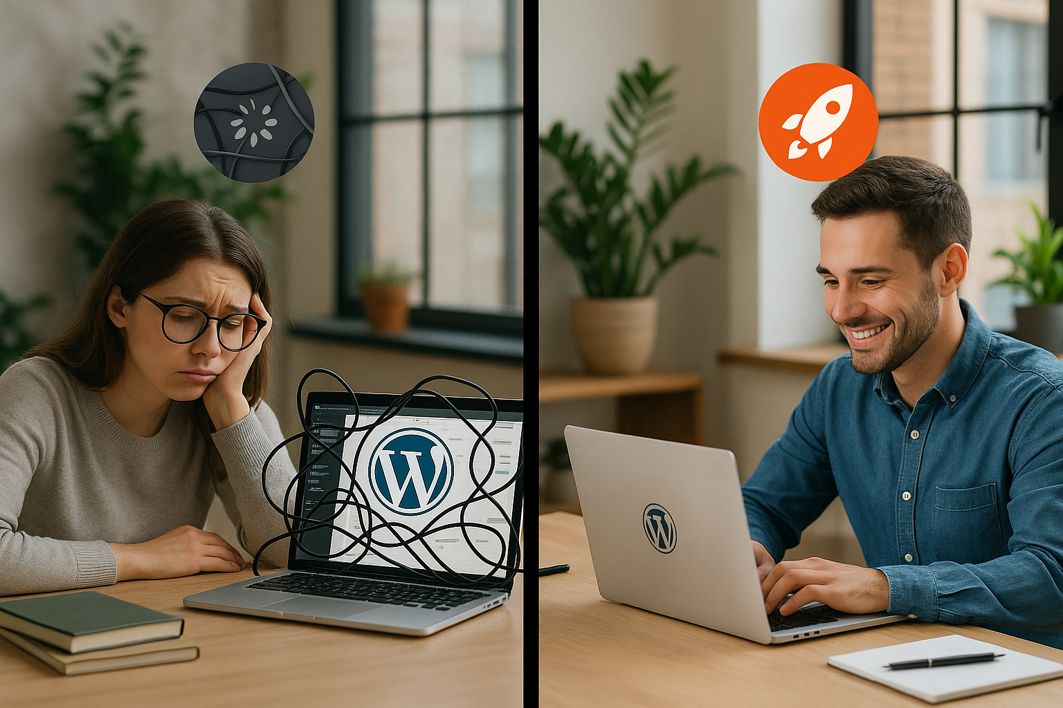
WordPress theme change often speeds up load times immediately because a lighter theme loads fewer scripts, smaller stylesheets and a leaner DOM structure. I'll show you why switching from a packed theme to fast code noticeably improves LCP, CLS and interactivity and how you can safely maximize the effect.
Key points
- Lightweight theme reduces requests and file sizes.
- Core Web Vitals increase through clean code.
- Change plan with tests, child theme and backup.
- Caching and image optimization enhance the effect.
- Maintenance keeps the speed permanently high.
Why a theme change brings immediate speed
Load many premium themes Animation, sliders, icon fonts and third-party scripts that hardly anyone uses but which burden every page. A fast theme relies on native WordPress functions, small CSS files and dispenses with superfluous dependencies, which directly reduces requests and parsing time. In practice, the total time to the first visible content is often halved because browsers have to calculate fewer DOM nodes and trigger fewer reflows. I prefer minimal code, as every kilobyte saved reduces the CPU and network load. If you switch and add design functions in parallel via Gutenberg or lightweight blocks, you will achieve the following with slimmer Setup often 30-50 % faster loading times.
When switching, the time to first byte often benefits indirectly because fewer PHP calls and templates are loaded. The render start moves forward because the new theme prioritizes critical resources and reduces render blocking. You can see the effect particularly clearly on mobile because smaller assets reduce the load on the wireless link and weaker processors are given less work. I like to test on a staging environment first to properly measure differences in the Largest Contentful Paint (LCP). If you also want to test on fast WordPress themes sets the basis for constant performance without tricks.
Typical brakes of heavy themes
Too many Features in a theme often mean hundreds of files, many HTTP requests and unused code. Large CSS bundles block rendering because the browser can only draw the layout correctly once it has been fully loaded. External fonts and icons increase latencies if they are integrated without subset and preload. Mega menus, carousels and parallax effects also cause repaints, which cost a lot on mobile devices. I often see outdated jQuery plugins that could replace modern CSS functions and cause unnecessary JavaScript execution.
Poorly configured image sizes also drive loading time when templates output huge visuals that exceed the viewport format. Fonts without a display strategy generate FOIT or FOUT, which increases the perceived loading time. Speed deteriorated. Inline scripts and unclear dependencies prevent effective caching and make defer/async management more difficult. Widgets that load data from third-party servers cause uncontrollable delays. Switching to a theme that offers modular components noticeably reduces these issues.

How to choose a fast theme
I first check the File size of the unmodified theme, the number of requests and the DOM output of a sample page. A good starting signal is less than 1 MB of assets without Page Builder and a DOM under 1,000 nodes. I also check whether the theme properly supports Gutenberg blocks because I use them to implement elements without a heavy builder. Modularity helps to activate specific features instead of loading everything across the board. I also test how the theme works with native functions instead of frameworks, as this reduces maintenance in the long term.
The following table shows criteria by which I recognize fast candidates and what effect these properties typically have. This makes it easier to assess options before use. I then supplement the measured values with live tests on staging to cover page types such as blog, landing page and product page. Start pages in particular are not very forgiving because this is often where most of the assets come together. If you check these points, you can make well-founded Decisions, instead of relying solely on marketing information.
| Criterion | reference value | Effect on speed |
|---|---|---|
| Theme assets (CSS/JS) | < 1 MB | Faster render start, less parsing |
| HTTP requests | < 40 on start page | Lower latency per page |
| DOM node | < 1.000 | Fewer reflows/repaints |
| Fonts | System stacks + preload | Stable CLS, fast LCP |
| Gutenberg/Blocks | Full support | No heavy builder required |
Step-by-step to a safe change
1. Measure baseline: I create baseline measurements with PageSpeed, GTmetrix and Lighthouse for the homepage and two subpages. This allows me to recognize the real gain later and compare page types. Mobile values play a central role, so I always test with a 4G profile and weaker CPU simulation. Screenshots of the waterfalls make it easier to analyze the causes. I note First Contentful Paint, LCP and total blocking time as core values.
2. Choose candidate: Lightweight themes with a good reputation and transparent changelogs give me Security. I check demo pages in the network panel and see if the theme loads features modularly. The documentation should provide instructions for performance options. I keep a child theme ready in case I want to minimally customize templates. Before going live, I test everything for staging.
3. Installation: I install the new theme, do not import any unnecessary demos and deactivate old shortcodes. I set the colors, typography and layout in the Customizer or with Gutenberg blocks. I save big design changes for later so that I can evaluate the speed effect first. For icons, I use SVG instead of icon fonts. Then I check all critical pages.
4. Migrate functions: I often replace sliders with static hero areas, as this speeds things up noticeably. Contact forms remain lean and do not load analytics in the background. For grids and layouts, I use block plugins with minimal overhead. I move former theme features to lightweight plugins only when I really need them. This keeps the package small and maintainable.
5. Fine-tuning: I minify CSS/JS, activate caching, set GZIP/Brotli and set lazy loading for images. I cover critical CSS rules for above-the-fold if the theme supports it. I load font files with preload and clean display swap. I convert images to WebP and make sure the dimensions are correct. I then repeat the measurements and document the gain.
Block themes, hosting and server influence
Block themes bring lean Templates and close integration with the editor, which reduces the need for page builders. This reduces the script load and makes changes faster. At the same time, the hosting decides on TTFB, caching and HTTP/2/3, which increase the effect of the theme change. LiteSpeed servers with integrated cache deliver strong values here, especially for returning visitors. I pay attention to server location, PHP version and object cache.
Who wants to know more about Block themes and hosting can find good background information on requirements and advantages. I pay attention to current PHP versions so that OPcache works and modern features run with high performance. A high-performance CDN node also helps with global target groups. For my projects, the combination of a lightweight theme, server-side cache and CDN provided the best consistency. In the hosting comparison, I was particularly impressed by a provider with LiteSpeed; in my experience, webhoster.de delivers very good results here.
Keeping an eye on Core Web Vitals
A faster theme reduces LCP-time because the hero image and large headline render faster. I make sure that critical images are scaled correctly and are not blocked in the viewport. For CLS, I check fixed placeholder heights, font loading strategy and refrain from subsequent DOM injections. The Interaction to Next Paint benefits from less JavaScript and a low main thread load. I prioritize the order: content first, then convenience functions.
Lighthouse shows me which scripts occupy the main time in the diagnostics tab. I divide up long tasks by loading functions only when needed. I remove unnecessary polyfills when browser targets no longer need them. I use native lazy loading for images and do not stream large media on the start page. With a clean Theme much of this can be achieved without hacks.

Mistakes that I consistently avoid
I do not use Mega-Themes with dozens of features when only a fraction are needed. Too many plugins after the change often destroy the profit; I keep the list short. I only use demo imports selectively so that no hidden scripts come along. I check mobile optimization separately because desktop values otherwise give a false impression. I also keep themes and plug-ins up to date in order to take performance fixes with me.
A common mistake: loading fonts without a subset and integrating several variants in parallel. I also don't configure autoptimize or cache plugins blindly, because incorrect defer/async breaks up the layout. I integrate third-party widgets sparingly so that external latencies do not dominate. I optimize images directly during the upload process instead of repairing them later. A tidy, light Theme prevents many of these stumbling blocks right from the start.
Additional speed levers after the change
After the change, I clear the Database revisions, transients and cron remnants disappear. I set up caching with rules for HTML, CSS/JS and fonts so that lean files benefit to the maximum. For global reach, I use a CDN with HTTP/3 and pay attention to Brotli. Image compression in WebP significantly reduces the amount of data without any visible loss of quality. A quick audit of the plugins often delivers further savings.
For the fine tuning I use Theme optimization tips, which I then implement in a targeted manner. I keep critical CSS quantities small and only build them for above-the-fold. I only load non-visible modules when there is interaction, which reduces the main thread time. I reduce the number of font families to what is necessary. Every dependency saved strengthens the Speed of the new theme.

Monitoring and maintenance after the change
Permanent Speed needs routine: I check the metrics weekly and observe outliers in the waterfall. I clean the database every month and throw out old revisions. I install updates promptly to take performance improvements with me. After major content changes, I test again because new widgets or images shift the balance. A small performance report helps me to spot trends early on.
On the server side, I keep the object cache active and monitor the hit rate. With heavy traffic, I scale caching rules and CDN edge locations. I write down changes with dates in order to clearly assign effects. In the event of slumps, I first analyze new plugins and third-party integrations. This keeps the lean Theme quickly in the long term.
SEO and clean migration without loss of ranking
When changing themes, I save structured data, meta tags and permalinks. I compare the output for breadcrumbs, article and product schema as well as Open Graph/Twitter Cards. If the theme changes the heading hierarchy or the markup structure, I adjust templates or block settings so that crawlers continue to receive consistent signals. I avoid 404 traps after template changes with a crawl of the staging URL structure and redirect checks. The robots.txt and meta robots settings remain unchanged; I test indexing rules before going live.
For image SEO, I check alt texts, file names and the handling of srcset/sizes. Themes that set hard sizes can deliver incorrect variants; I adjust sizes so that LCP images are optimally hit in the viewport. I keep structured data independent of the theme in a slim plugin or per block so that a design change does not destroy it. After the go-live, I check the Search Console for coverage and rich result changes and correct any anomalies promptly.
WooCommerce: special performance pitfalls and fixes
Store themes bring their own burden: mini cart fragment requests, complex product galleries and AJAX filters. I deactivate cart fragments on pages without shopping cart interaction, if the theme allows it, and use static mini-cart previews. I optimize product images more aggressively because they are usually the largest LCP-variants are only loaded after selection instead of in advance. Archive pages with many products get server-side caching and a clean pagination setup; I only use infinite scroll if interaction is prioritized cleanly.
I keep template overrides to a minimum to make updates easier. I reduce the number of widgets for „similar products“ and reviews and load them below the visible area. I check search and filter plugins for queries; I mitigate costly database queries with object cache and, where appropriate, indexes. Checkout pages are sacred: as few scripts as possible, no sliders, no external widgets. This is directly reflected in interactivity and conversion.
FSE/Block-Themes: theme.json, templates and performance
For block themes, I use the theme.json, to set global styles and avoid unnecessary CSS. Uniform typography, spacing and color rules reduce the need for custom CSS and make maintenance easier. I keep template parts (header, footer) lean; no nested blocks without necessity. Global styles save additional files, and deactivated features (e.g. gradients, duotone) reduce the output CSS. Important: Use block patterns in a targeted manner instead of giving each area its own solutions - this reduces DOM variants.
When migrating from classic themes, I clean up shortcodes and replace them with native blocks. I check whether block-specific assets are loaded conditionally. For hero areas, I deliberately set the largest image and give it fetchpriority=”high” so that the browser loads it preferentially. This way, I don't give the LCP a chance to slip to the back.
CSS/JS strategy in the new theme
I plan CSS modularly: small, critical rules inline or as a separate Critical CSS file, the rest asynchronously. I use utility classes sparingly; too many utilities bloat the HTML code. Components get local styles instead of global catch-all rules. For JavaScript: as little as possible, as late-loaded as possible. I only load interactive modules after idle or interaction. I split long tasks; I relieve expensive functions via requestIdleCallback, intersection observer and debouncing.
I optimize fonts with subsetting, preload and clean font display. I use CSS size-adjust to compensate for metric differences and reduce CLS with fallback fonts. I replace icon fonts with SVG sprites. I check whether the theme can parallelize HTTP/2/3 and does not create artificial bundles. Source maps are not used in production; this reduces transfer and protects code.
Third-party scripts and consent: governance instead of uncontrolled growth
External scripts are often the biggest residual load after the theme change. I take an inventory of them, group them by use (analytics, chat, ads) and set clear loading conditions. Consent-controlled lazy loading prevents unnecessary network and CPU load. I use tag managers in a disciplined manner: no duplicate tags, no unrestrained experiments on all pages. I only load widgets such as ratings, maps or social feeds on pages where they really add value - and preferably after interaction.
For A/B tests, I prefer server-side variants or very lightweight clients. I delete pure comfort features (cursor effects, particles, heavy animations) in the standard experience and offer them as an option at most. This keeps interactivity stable and improves INP in the long term.
Read lab and field data correctly
I measure in lab environments for fast iteration and check field data to map real users. PageSpeed/Lighthouse help with debugging, but Search Console's Core Web Vitals reports show if real visitors are benefiting. After the change, I observe the development over several weeks, as field data comes in with a time delay. I define budgets for each page group: maximum CSS/JS quantities, DOM limits, request limits. If a new feature exceeds the budget, I optimize or discard it.
I document measurement conditions (network profile, device, cache status) so that comparisons remain valid. Repeatable tests for staging and random checks in production are important. I correlate outliers in the waterfall with deployments in order to find the cause quickly.
Rollback, versioning and secure go-live
Before the change, I create complete backups and have a rollback plan ready. I version theme and child theme customizations so that changes remain traceable. I go live at off-peak times, monitor logs and metrics closely and maintain a freeze for 24-48 hours. In the event of problems, I first deactivate optional modules, then third-party plugins and finally roll back. Blue-green deployments with staging-to-live switch reduce downtime and stress.
Accessibility and UX as a performance factor
A fast theme is also accessible: clear focus states, meaningful landmark roles and heading hierarchies. I respect preferred-reduced-motion and avoid excessive parallax or scroll triggers. Forms get native elements instead of heavy JS components. Clean UX reduces Javascript, prevents layout jumps and strengthens the perceived speed - especially on mobile devices.
Brief summary: speed gain through theme change
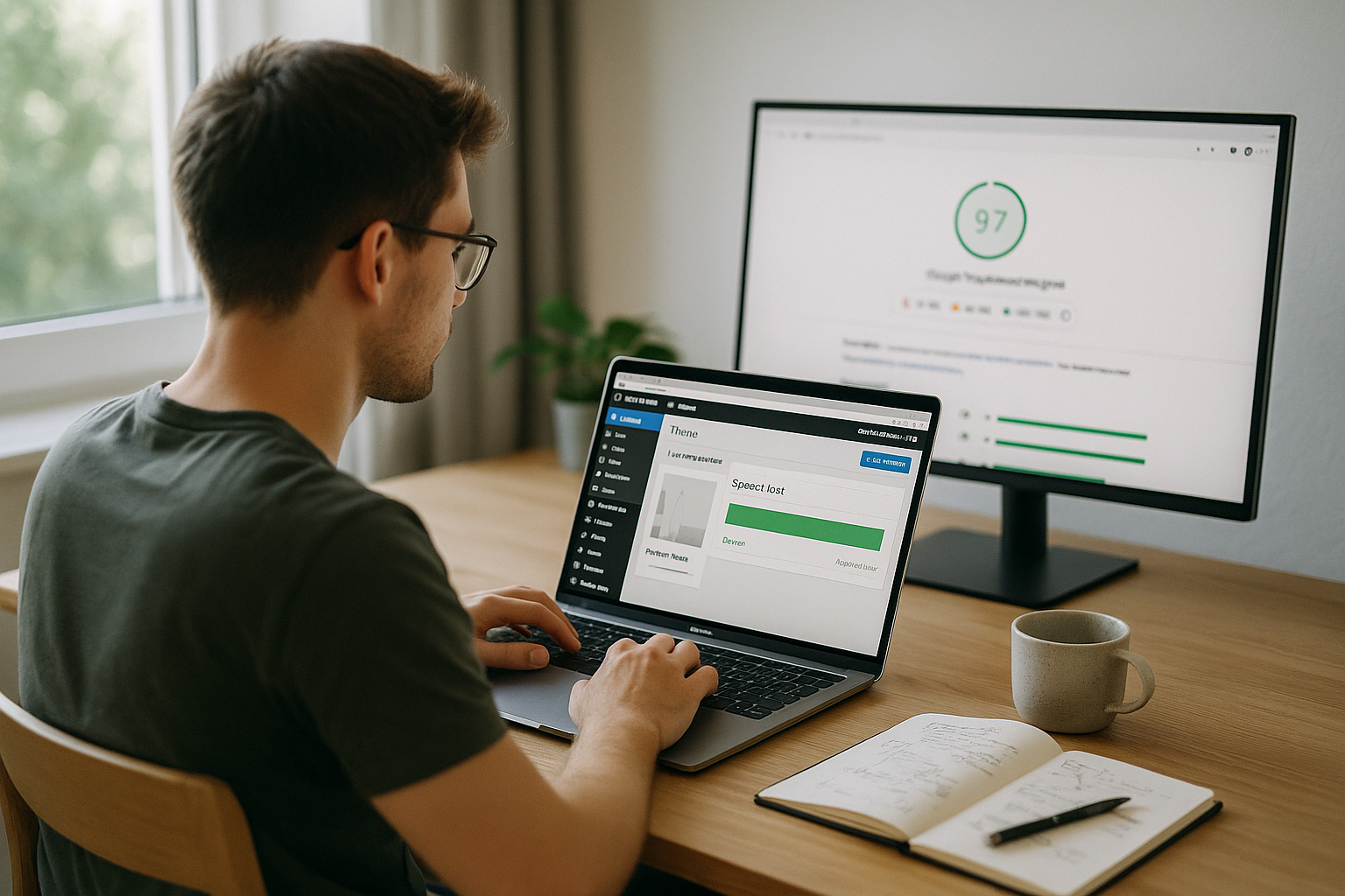
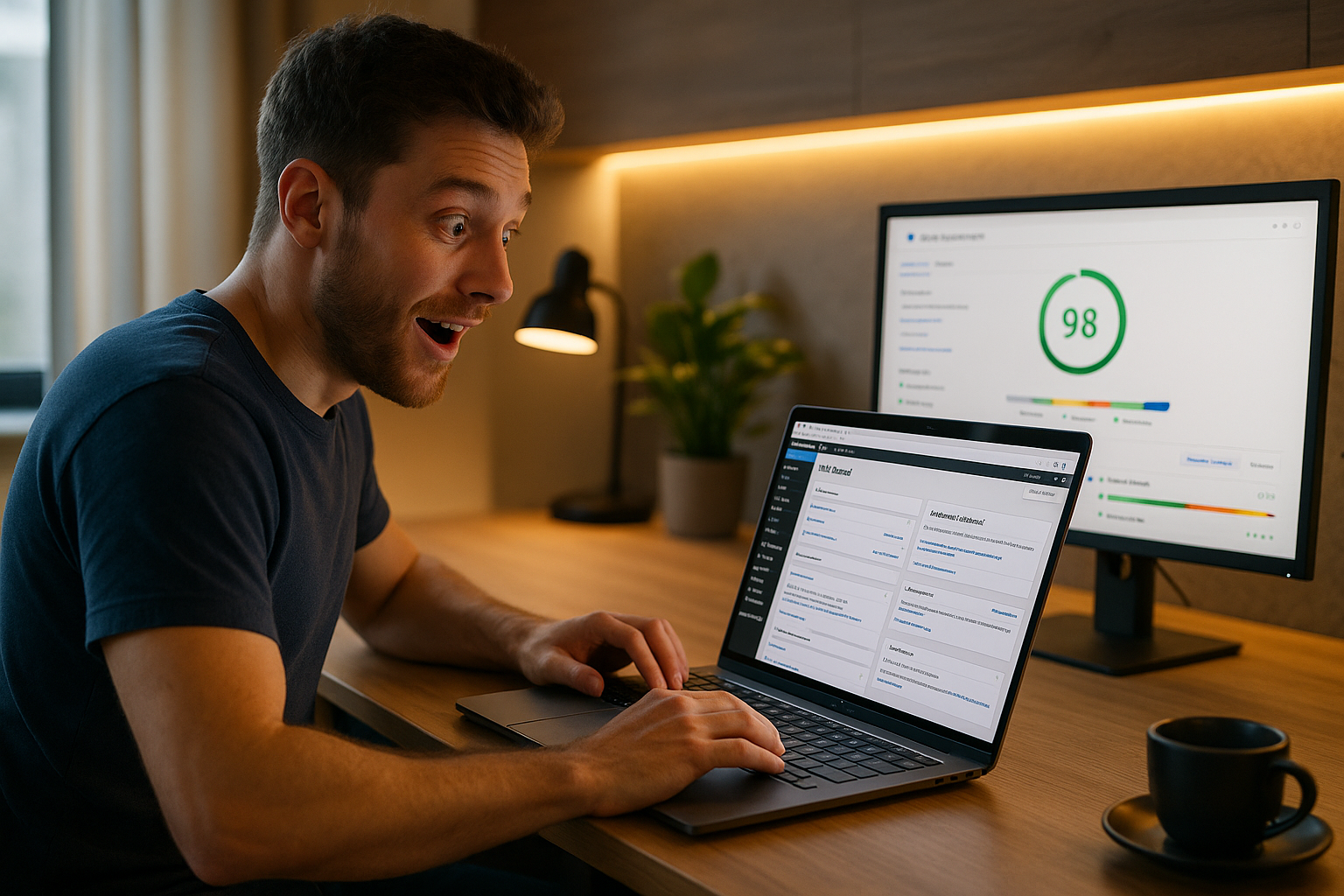
A lighter theme reduces requests, file sizes and computing load - this has an immediate effect on LCP, CLS and interactivity. In many projects I saw jumps from 60 to 95+ in mobile scores without losing design quality. The biggest leverage lies in removing unnecessary scripts and using native functions. With clean hosting, caching and WebP, you can also gain measurable milliseconds. If you follow these steps, you will notice the change not only in the test, but in real user behavior.
I rely on a few, well-configured components and adhere to measurable criteria. A modern server with LiteSpeed and solidly configured caches reliably bring the effect to the street. Pay attention to sensible fonts, clear image sizes and a block editor instead of a heavy builder. This keeps the site fast, maintainable and ready for new content. This is exactly what a consistent Theme change in WordPress.