Optimize images web in 2025 means choosing the right formats, compressing cleverly, delivering responsively and accelerating via CDN. In this article, I will show you in a practical way which tools, settings and workflows reduce loading times, ensure quality and improve search results.
Key points
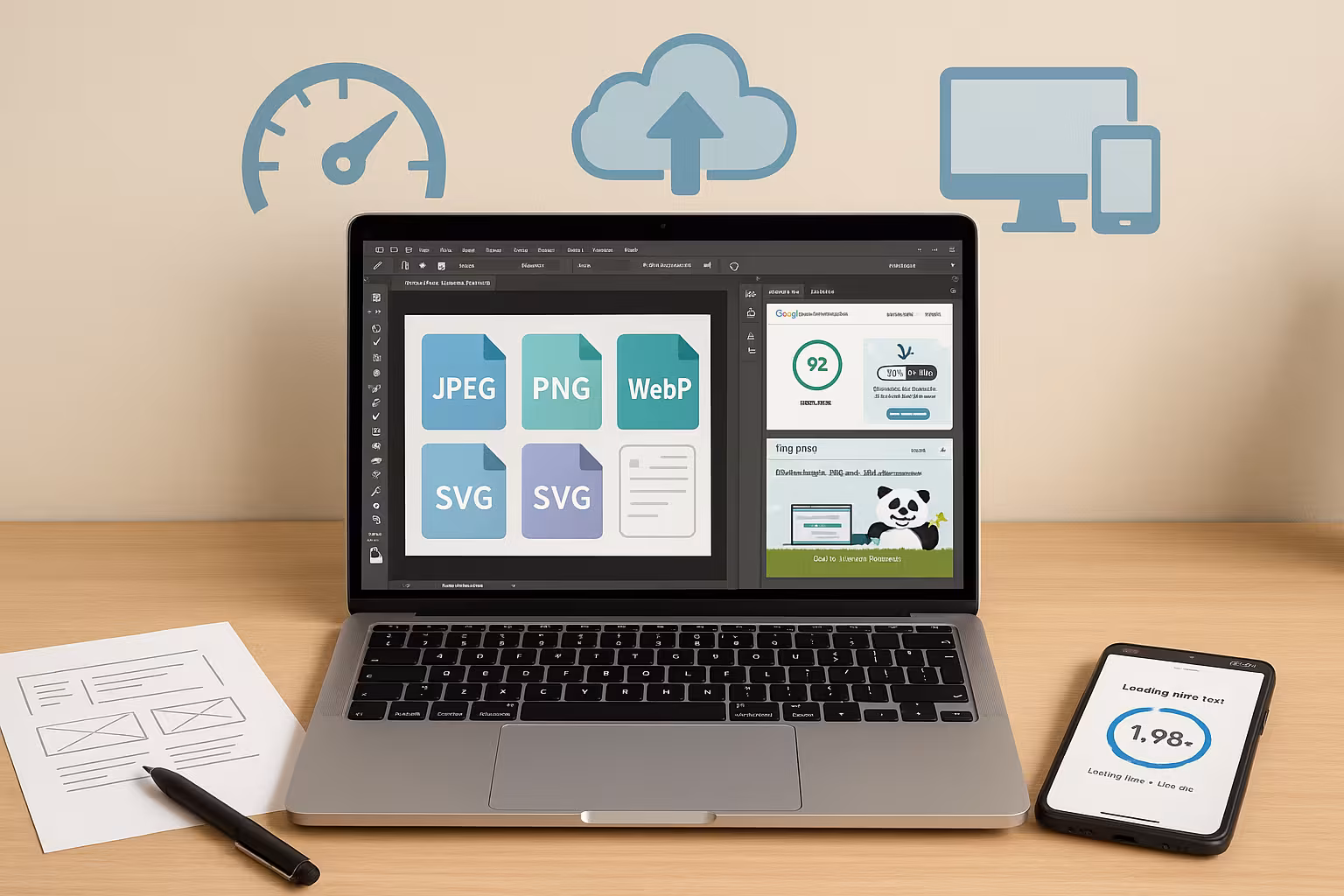
- FormatsJPEG/PNG for classics, WebP/AVIF for maximum savings
- CompressionLossy, Lossless or Glossy depending on motif and goal
- Responsive: correct srcset-Sizes and suitable resolution
- AutomationPlugins and CDN for upload and delivery
- WorkflowCrop, metadata check, QA before the go-live
Why image optimization drives ranking and experience
I hold Loading time for the most visible quality of a page, because images often carry the largest proportion of data. Those who deliver large files unchecked risk higher bounce rates and lower rankings because speed remains a relevant factor for the search. On mobile devices, disadvantages become apparent immediately when unscaled photos exceed the data volume and delay interactions. I therefore plan each motif so that the file size, compression and output format match and the visual effect is retained. This discipline pays off directly on SEOconversion and user satisfaction - measurable through lower transfer volumes and faster start-render times.
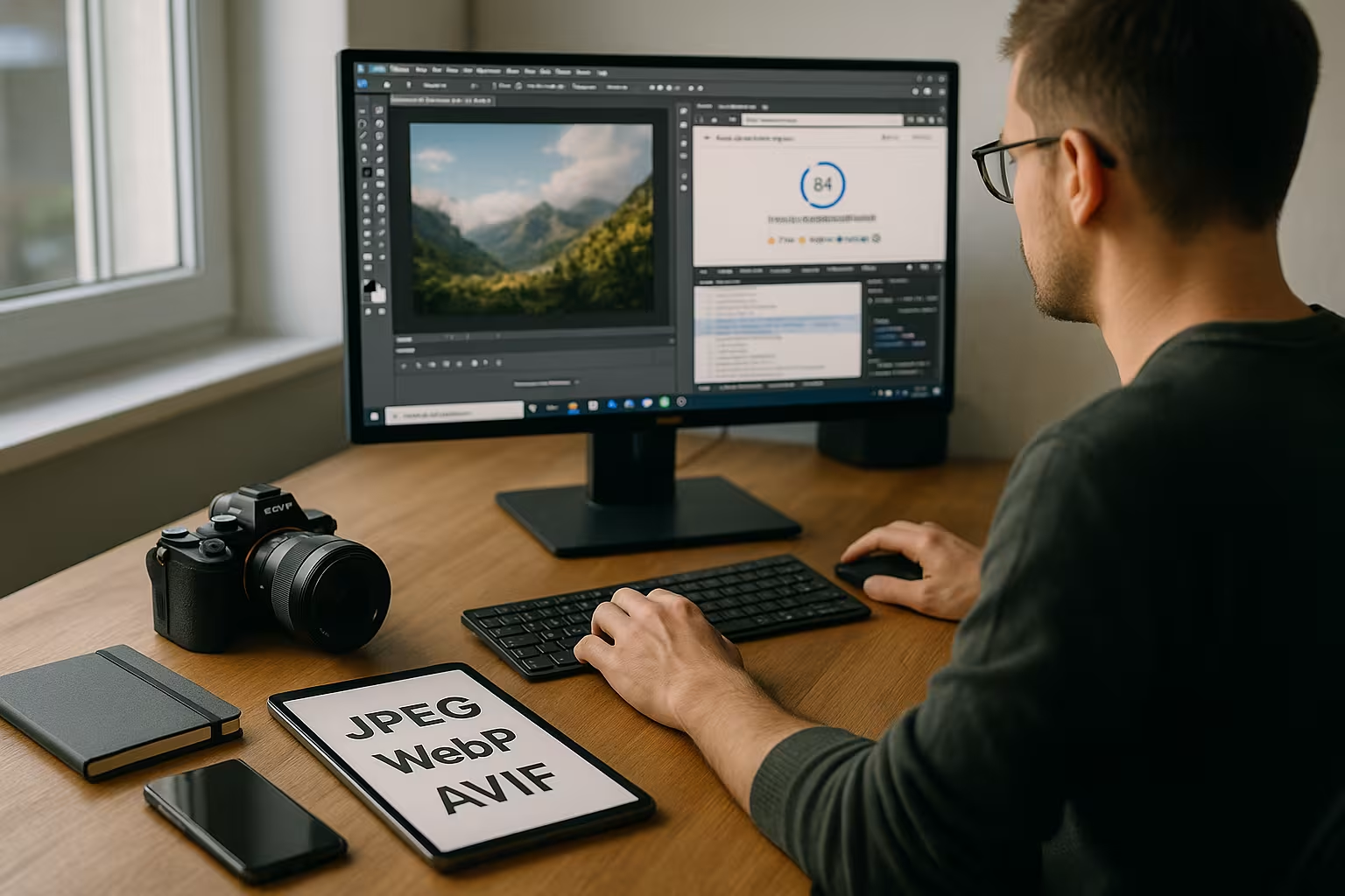
Formats 2025: JPEG, PNG, WebP, AVIF, SVG in correct use
I choose JPEG for photos with many color gradations, use PNG for transparency or graphics with clear edges and use SVG for icons or logos. For maximum savings, I use WebP and AVIF, which deliver significantly smaller files with the same perception and master transparency. For motifs with fine textures, I test both modern variants, as AVIF often achieves even better rates than WebP, while WebP is widely supported in tools and CMS. If you need a direct comparison, take a look at my reference to the WebP vs. JPEG article and clearly delineates application scenarios. It remains important: I base the choice on the motif and the necessary browser coverage so that Quality and charging time remain in balance.

Implementing resolution, cropping and responsive images correctly
I only provide images in the required pixel width and crop motifs to the relevant image section. This saves bytes and focuses the eye on the content that really counts. I use srcset and sizes to give the browser several variants so that it loads the ideal size depending on the viewport. For practical implementation, the guide to Responsive Images Best Practicesbecause correct size specifications prevent unnecessary transfers. I test the result via DevTools: Display, DPR handling and Cumulative Layout Shift must be correct so that the Performance remains stable.
Art direction with picture: Control motifs per breakpoint
I use the picture-element when motifs in different viewports are not only scaled, but also cut differently should be. For mobile hero areas I choose narrower sections (fewer empty areas), for desktop I choose more generous variants. This way, I increase the relevance of the visible content and reduce unnecessary pixels. I deliberately define the order of sources: modern formats first, then fallback so that browsers choose cleanly. For icons, I stick with SVGas it scales without loss and can be colored using CSS.
DPR, sharpness and x-descriptors
I supply suitable variants for high-resolution displays via x-descriptors (1x, 2x, 3x). I pay attention to the balance between sharpness and bytes: not every graphic needs a 3x asset. I solve critical UI graphics (logos, icons) with SVG, photos usually get 1x and 2x. With image-set In CSS, I use backgrounds DPR-consciously if the motif has to come from a background image. For the actual content I use img because accessibility, SEO and LCP benefit from it.
Compression: lossless, lossy, glossy - what suits which motif?
I decide the Compression level according to the intended use and image content, not across the board. Product photos with fine structures or skin tones benefit from lossless or a moderate glossy profile so that details remain clean. Mood images, teasers and background motifs can often tolerate stronger reductions as long as no banding artifacts or halos occur. Tools such as ShortPixel offer lossless, glossy and lossy, TinyPNG shines with particularly strong PNG reduction, and Squoosh allows direct A/B comparison in the browser. I save the setting as a repeatable standard and randomly check whether Artifacts become visible.
Layout stability: avoid dimensions, placeholders and CLS
I deposit width/height or use CSS aspect-ratioso that the browser reserves space and no layout jumps occur. For large images I use light Blur/LQIP placeholderso that users immediately see an orientation until the full quality is loaded. I check the final layout containers in the DevTools: If images are rendered larger than delivered later, the sharpness suffers; if they are significantly smaller, I waste bytes.
Metadata, color spaces and clean files
I remove superfluous Metadata such as EXIF, GPS or preview images before uploading, because these parts are rarely useful on the web. ImageOptim, IrfanView or plugin pipelines do this automatically and thus save additional kilobytes [1][5]. For consistent colors, I convert photos to sRGB so that browsers and devices reliably adopt the display. For PNGs, I check the palette and reduce colors if there is no visible disadvantage to the visual appearance. This is how I keep files lean, keep the Quality stable and reduce unwanted variances in the rendering.
Lazy loading, priority and LCP focus
I set Lazy Loading for images outside the viewport to minimize initial requests. The Hero/LCP image I deliberately load it without a lazy flag, provide it with fetchpriority="high" and use decoding="async" for smooth rendering. If necessary, I add a preload of the appropriate source variant (format and size) so that there is no duplicate retrieval. I monitor the metrics: If the Largest Contentful Paint is recognized too late, I adjust image selection, priority or markup.
Automation with WordPress plugins: upload, bulk and conversion
I automate the Optimization in the CMS so that every upload is immediately compressed, scaled and converted to WebP or AVIF if required. ShortPixel, EWWW Image Optimizer, WP Compress or Smush also take over the subsequent editing of the media library. Bulk jobs help me to bring historical stocks up to modern standards without having to manually check every image. EWWW also scores with script optimization and optional CDN, which further accelerates the overall delivery [2][3][5][6]. With clear rules per motif category, I keep the Quality limits consistent.

CDN and image delivery: proximity, cache and on-the-fly optimization
I use CDN so that images come from geographically close nodes, are stored in the cache and are converted dynamically if required. Modern solutions generate WebP or AVIF on the fly, respect accept headers and deliver exactly the variant that the client understands. This reduces time-to-first-byte and minimizes latencies, especially for international audiences. For WordPress, I like the integration of a Image CDN with Bunny.netwhich elegantly couples conversion and caching. This way I ensure faster first contentful paints and a robust User experience [2][3].
Caching headers, versioning and browser cache
I deliver static images with long Cache control-times and set to immutablewhen files are created via Versioning (file name or query string with hash) can be changed. This keeps caches consistent and users receive updates without "stale" artifacts. I pay attention to clean ETag/Last-Modified-configurations at the origin and make sure that the CDN cache correctly distinguishes between formats and sizes (e.g. via Vary header). For large relaunches I plan Purge-strategies so that old assets do not return.
Hosting tips for media-rich websites
I choose hosting with SSD-storage, a modern PHP version and sufficient CPU/RAM reserves so that image processing and caching do not come to a standstill. An optional CDN helps with traffic peaks, relieves the load on the source and makes delivery predictable. If you have a lot of media, you benefit from scalable resources and monitoring that identifies bottlenecks at an early stage. In projects with a high proportion of images, providers such as webhoster.de have proven themselves through fast provision and sensible upgrades. So the Performance stable even during campaigns.
Using background images in CSS: consciously
I use background-image only if it makes sense in terms of content (purely decorative motifs). Relevant images belong in the HTML flow so that alt texts, semantics and prioritization take effect. If there has to be a background image, I minimize its size, work with image-set for DPR and choose sensible background-size-strategies to avoid zoom artifacts or unnecessary pixels. I scale large hero backgrounds to the maximum width instead of providing them in an oversized resolution.
Animations: Replace GIF, use video sensibly
I replace animated GIFs consistently through MP4/WebM or animated WebP/AVIF, because the file sizes are significantly smaller. Loops are given short durations and reduced frame rates so that they don't permanently use up bandwidth. For product demos or explanations, I tend to use video because streaming, controls and poster frames are superior. Where animation is only a decoration, I check whether a subtle CSS animation is enough - it saves bytes and increases the calmness of the layout.
Practical workflow: From the camera to the CMS
I start with the Cutting to the target ratio, then I scale to the maximum display width of the page. I then remove metadata, set sRGB and test suitable compression levels for each image type. For responsive playout, I create several sizes and store them using srcset and sizes. When uploading, the plugin takes care of the rest: conversion to modern formats, quality limits and bulk optimization. Before going live, I check Lighthouse, Core Web Vitals and upload in practice with real Mobile radio-connection.
SEO and accessibility: texts, alt attributes and context
I forgive Alt textsthat describe the image content concisely and precisely. Decorative images are given empty alt attributes so that screen readers skip them. I formulate file names and captions eloquently; they pay attention to context and findability. Texts should not be burned into the image, but should be placed on the page as real text - accessible, indexable and more flexible in its presentation. I keep contrast and legibility high so that images support the message and do not hinder it.
Quality assurance, budgets and monitoring
I define Weight budgets per page (e.g. maximum size per image, total quantity above the fold) and monitor them automatically. I check LCP, CLS and TBT in Lighthouse, DevTools and Core Web Vitals. I supplement WebPage analyses with visual regression tests so that adjustments to compression levels do not produce any surprises. I document the selected Breakpointssizes and quality values so that teams work consistently. During operation, I monitor the views per variant, remove unused sizes and prevent uncontrolled growth in the media library.
Tool and plugin comparison: strengths, formats, costs
Depending on the task Desktop-apps or online tools and use plugins with bulk functions in the CMS. Squoosh with instant A/B comparison is suitable for single images, TinyPNG, Optimizilla or Compressor.io for series uploads. On the Mac, I use ImageOptim to remove metadata and get lean files. In WordPress, ShortPixel or EWWW permanently save time and offer modern formats and additional features. In comparative tests, the web tools often achieve 50-70 percent reduction without visibly poorer quality, which greatly reduces the loading time [4][5].
| Tool/plugin | Kind | Strengths | Formats | Price |
|---|---|---|---|---|
| ImageOptim | Desktop (Mac) | Lossless, metadata removal, simple interface | JPG, PNG, GIF | Free of charge |
| TinyPNG | Online, Plugin | Web app, API & WP plugin, strong compression | PNG, JPG, WebP | Basic free |
| ShortPixel Image Optimizer | WordPress plugin | Auto compression, WebP/AVIF, intelligent cropping | JPG, PNG, GIF | Premium |
| EWWW Image Optimizer | WordPress plugin | Bulk optimization, WebP, script optimization, CDN possible | JPG, PNG, GIF | Free/Paid |
| Squoosh | Online | Interactive setting, many formats, instant comparison | Various incl. WebP, AVIF | Free of charge |
| Optimizilla | Online | Quality preview and control, batch upload | JPG, PNG, GIF | Free of charge |
| Compressor.io | Online | Very good compression for many web formats | JPG, PNG, WebP | Free of charge |

Typical errors and quick corrections
- Deliver originals that are too large: I scale to the maximum display width and create several variants.
- Load hero image lazy: The most important image gets priority, no lazy, but fetchpriority.
- Missing dimensions: set width/height or aspect-ratio to avoid CLS.
- Only offer one format: I combine AVIF/WebP with clean fallback.
- Text in the image: I replace them with real HTML text for SEO and accessibility.
- Unnecessary transparency: Where possible, I replace PNG with JPEG/WebP without alpha.
- Rigid breakpoints: I choose sizes out of real use, not out of habit.
- No versioning: I build in hashes and use long caches to save revalidations.
Briefly summarized
I prioritize Format selectionclean resolution and sensible compression, because they have the greatest impact on loading time. Modern variants such as WebP and AVIF provide the best mix of quality and size, while SVG scales vector graphics perfectly. With srcset and sizes, devices get exactly the version they need, and a CDN brings images to the user faster. Plugins automate the routine, remove metadata and convert during upload so that the effort remains low. If you implement these steps consistently, you will increase Speedvisibility and conversion - measurable in everyday life and noticeable for visitors.