Skip to content
Many WordPress web fonts load in parallel, block rendering and thus prolong LCP and FCP - especially on mobile devices. In this article, I'll show you why too many fonts cost time, how FOIT/FOUT occur and which specific measures will noticeably speed up your site.
Key points
- Reduction to a few cuts reduces requests and data transfer
- Preload and Preconnect prioritize important files
- font-display Prevents invisible text (FOIT)
- Local hosting saves external latencies and CORS
- Subsetting removes unused glyphs and makes fonts small
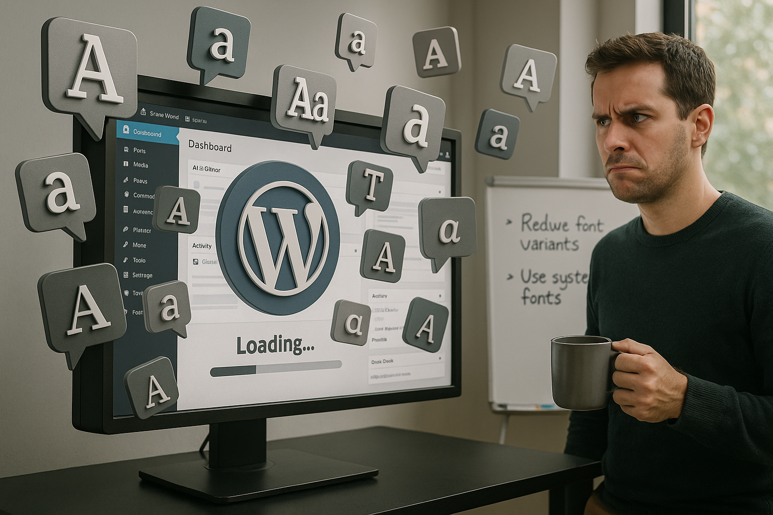
Why many web fonts in WordPress cost loading time
Each additional font brings further Requests, more DNS lookups and additional kilobytes. Several families with Regular, Bold and Italic quickly add up to 500-1000 KB before text appears cleanly. This has a direct effect on the Largest Contentful Paint (LCP) because the browser can only render when important fonts are available. Just three fonts can stretch the first rendering by 20-50 percent, which hits users on slow connections hard. I therefore focus on a few, clearly defined cuts and safe fallbacks to avoid render blocking.
How web fonts are loaded in WordPress - and where it gets stuck
Web fonts often come from external providers or theme options, which means additional DNS-lookups and TLS handshakes. With FOIT (Flash of Invisible Text), the browser waits for fonts and shows invisible text until then, which reinforces the impression of „nothing happening“. FOUT (Flash of Unstyled Text) is better, but produces short layout jumps when switching from the fallback to the web font. Without prioritization, preconnect and sensible caching, loading time and TTFB feeling increase. I plan the integration so that main content always appears first and fonts flow in afterwards without stuttering.
Audit and monitoring: make all fonts visible
Before I optimize, I get a complete overview. In the DevTools, I filter in the Network tab for „Font“, check file names, transfer sizes and Initiator (theme, plugin, block editor). The waterfall times show me whether fonts are blocking the critical path. In the Coverage panel, I can see whether large @font-face CSS blocks only minimal can be used. A performance trace reveals whether the text render blocks until WOFF2 files are ready. At WordPress level, I deactivate plugins on a test basis to identify hidden font sources (page builders, icon packs). My core metrics here: number of font requests, total KB, time to first readable line, FOUT/FOIT duration and impact on LCP/FCP in the filmstrip.
I compare lab and field data: A fast desktop via LAN masks problems that only become visible in the 4G network. That's why I test with low CPU and bandwidth throttling to simulate realistic mobile conditions. Only when the chains are clean and fallbacks render stably do I add further typo fine-tuning.
Measurable effects on Core Web Vitals
LCP, FCP and CLS react sensitively to imprudently loaded Fonts, because delayed fonts shift layouts and obscure content. According to HTTP Archive, pages with web fonts transfer significantly more data on average, which is more noticeable on mobile devices. The PageSpeed Insights documentation clearly explains that render-blocking resources lengthen the path to the first display. Prioritized requests shorten this chain and noticeably reduce waiting times. If you want to delve deeper into prioritization, you can find background information at Request prioritization, which I use specifically for extensive themes.

Technical causes in detail
Many individual files, non-combined styles and missing subsetting increase the Payload unnecessary. Without HTTP/2 or HTTP/3, requests are often queued and block the render path. External domains such as fonts.googleapis.com add additional latencies, which add up for multiple families. CORS headers are necessary, otherwise the browser aborts preloads or does not use them. I prevent such stumbling blocks through local provision, cleanly set headers and the targeted limitation to two to three cuts.
Avoid typographic pitfalls: Metrics, fallback quality and faux styles
In addition to the pure file size, typo details influence the stability of the display. If the metrics of the fallback and web font differ greatly, visible jumps occur during the swap. I equalize the height by size-adjust and lock synthetic styles to prevent „false“ bold/italic:
@font-face {
  font-family: 'Inter';
  src: url('/fonts/Inter-roman.var.woff2') format('woff2');
  font-weight: 100 900;
  font-style: normal;
  font-display: swap;
  /* Adjust metrics to reduce CLS */
  size-adjust: 100%;
  ascent-override: 90%;
  descent-override: 20%;
  line-gap-override: 0%;
}

/* visually adjust fallback font */
body {
  font-family: system-ui, -apple-system, Segoe UI, Roboto, Inter, sans-serif;
  font-size-adjust: 0.5; /* Better x-height adjustment */
  font-synthesis: none; /* Prevents faux-bold/italic */
}
I define a separate axis or static file for italic variants and avoid faux italics. I also assign font-weight precisely (300/400/600/700) so that the browser does not interpolate. This fine-tuning takes little time, but prevents noticeable layout changes when switching from the fallback to the web font.
Make it leaner: three immediate measures
I reduce the number of families, replace decorative cuts with fallbacks and consistently use font-displayswap. System stacks (-apple-system, Segoe UI, Roboto, Noto Sans, Ubuntu, Cantarell) quickly output text while the web font loads in the background. Headings usually only need a bold cut, body text a regular variant. I also remove unnecessary remote calls to generate fewer requests. If you want to get even more out of it, you can Reduce HTTP requests and thus relieve the entire critical path.
Replace icon fonts: SVG saves requests
Many themes come with icon fonts (e.g. for social or UI icons). A single icon font can weigh between 30 and 80 KB and can be @font-face influence the render path. I replace such fonts with SVG - inline or as a sprite. This reduces requests, avoids FOIT/FOUT for icons and ensures razor-sharp presentation on all displays. If a complete changeover is not possible immediately, I sub-select the icon font to the pictograms actually used and set font-display: optional, so that the page never waits for the icon font:
@font-face {
  font-family: 'ThemeIcons';
  src: url('/fonts/theme-icons-subset.woff2') format('woff2');
  font-display: optional; /* UI remains operable, icons pop in later */
}
Inline SVG also allows me to control colors and states via CSS without loading new files. This fits perfectly with the goal of keeping the critical rendering chain as short as possible.
Using preload, preconnect and prewarming correctly
I use Preconnect for the decisive Domain, to prioritize DNS, TCP and TLS. I only use preload for really critical WOFF2 files, otherwise I waste priority on secondary resources. The tag must set as=“font“, type=“font/woff2″ and crossorigin, otherwise the browser will partially ignore the hint. Too many preloads sabotage each other and push more important content to the back. A lean, tested set of hints shortens the time to the first readable line:
Host locally and remain GDPR-compliant
I download required fonts, subset them and serve them directly from my own Server. This saves external DNS lookups, reduces CORS problems and gives me complete cache control. A local approach facilitates long cache runtimes and ensures consistent availability. For legal clarity and practical implementation, my guide to Google Fonts local. This is how I keep technology and data protection clean without sacrificing typography.

Subsetting and variable fonts: maximum effect with small size
Instead of loading complete language packs, I only keep the required Glyphs and remove exotic sets. Latin without extensions often saves 40-70 percent file size, which is particularly noticeable on mobile devices. Variable fonts replace several static files with a single resource with axes for weight and italics. This reduces requests and improves prioritization if I only preload one WOFF2 file. At the same time, the visual diversity is maintained without having to transfer five sections individually.
Variable fonts in practice: targeted use of axes
In the implementation, I avoid unnecessarily wide axis areas. I limit wght for example, to 400-700 if only regular and bold are used. This reduces the complexity of rendering and maintains visual consistency. For responsive typography, I systematically use numerical weights, not keywords:
@font-face {
  font-family: 'InterVar';
  src: url('/fonts/Inter-roman.var.woff2') format('woff2');
  font-weight: 400 700; /* Narrow range instead of 100-900 */
  font-style: normal;
  font-display: swap;
}

h1, h2 { font-family: 'InterVar', system-ui, sans-serif; font-weight: 700; }
p { font-family: 'InterVar', system-ui, sans-serif; font-weight: 400; }

:root { font-optical-sizing: auto; }
/* Special cases per axis, where appropriate:
.element { font-variation-settings: 'wght' 650; } */
This maintains the flexibility of a variable font without burdening the system with unnecessary intermediate stages.
Which optimization brings how much? (Overview)
The following overview shows what I use in practice to achieve the greatest Savings and what I pay attention to. Values are empirical ranges and depend on the initial state, theme and number of edits. I test every change with PageSpeed Insights and a WebPageTest run to identify side effects. I then make targeted adjustments to threshold values and caching. This increases the certainty that every measure gains real time.
| Optimization approach | Typical savings | Important note |
|---|---|---|
| Reduction to 2 cuts | 150-400 KB | Clean Fallbacks set |
| font-display: swap | + quickly readable text | Accept FOUT instead of FOIT |
| Local hosting + long caching | 2-3 requests less | Cache control/ETag correct |
| Preconnect + targeted preload | 50-200 ms | Only critical Files |
| Subsetting (Latin base) | 40-70 % smaller | Expandable at a later date |
| Variable font instead of 4 files | -3 Requests | Only use WOFF2 |

Use plugins sensibly - without overhead
OMGF loads Google fonts locally, automatically subsets and truncates unnecessary Sign out. Asset CleanUp allows me to deactivate fonts page by page when a specific template doesn't need them. Autoptimize combines CSS, minifies and can extract fonts so that critical styles come first. I test the combinations carefully because excessive aggregation under HTTP/2 can be counterproductive. The goal remains a stable, short chain to the first visible content.
Practical implementation in WordPress: code examples
Many themes or page builders include fonts automatically. I remove duplicate sources, switch to local files and set clear priorities - preferably in the child theme.
1) Remove external fonts from the theme and load local fonts
/* functions.php in the child theme */
add_action('wp_enqueue_scripts', function() {
  /* Customize/find example handles of the theme/builder */
  wp_dequeue_style('google-fonts');
  wp_deregister_style('google-fonts');

  /* Include your own, local font styles */
  wp_enqueue_style('local-fonts', get_stylesheet_directory_uri() . '/assets/css/fonts.css', [], '1.0', 'all');
}, 20);
2) Targeted preload for the critical WOFF2
/* functions.php */
add_action('wp_head', function() {
  echo '';
}, 1);
3) Set caching and CORS header for fonts
# .htaccess (Apache)

  AddType font/woff2 .woff2


  Header set Cache-Control "public, max-age=31536000, immutable"
  Header set Access-Control-Allow-Origin "*"
# Nginx (server block)
location ~* .(woff2|woff)$ {
add_header Cache-Control "public, max-age=31536000, immutable";
add_header Access-Control-Allow-Origin "*";
types { font/woff2 woff2; }
}4) Example fonts.css with subsets and swap
@font-face {
  font-family: 'Inter';
  src: url('/fonts/InterLatin-400.woff2') format('woff2');
  font-weight: 400;
  font-style: normal;
  font-display: swap;
  unicode-range: U+000-5FF; /* Latin base */
}

@font-face {
  font-family: 'Inter';
  src: url('/fonts/InterLatin-700.woff2') format('woff2');
  font-weight: 700;
  font-style: normal;
  font-display: swap;
  unicode-range: U+000-5FF;
}
Multilingual pages: Load subsets per locale
For international projects, I only load the necessary fonts. In WordPress, I can load per Locale register different styles. For example, German/English remains with a lean Latin subset, while a Polish or Turkish variant gets extended glyphs - but only where it is needed.
/* functions.php */
add_action('wp_enqueue_scripts', function() {
  $locale = get_locale();

  if (in_array($locale, ['de_DE','en_US','en_GB'])) {
    wp_enqueue_style('fonts-latin', get_stylesheet_directory_uri().'/assets/css/fonts-latin.css', [], '1.0');
  } elseif (in_array($locale, ['pl_PL','tr_TR'])) {
    wp_enqueue_style('fonts-latin-ext', get_stylesheet_directory_uri().'/assets/css/fonts-latin-ext.css', [], '1.0');
  }
});
Important: I make sure that body text always has a solid system fallback chain. This ensures that the page remains readable even if a language file fails or a cache is cold.
Hosting, cache and CDN as a multiplier
Fast NVMe SSDs, HTTP/3 and a CDN shorten TTFB and deliver Fonts faster globally. A server-side cache reduces backend requests, while browser caching fetches fonts from the local cache for months. Brotli for WOFF2 hardly brings any more, but for CSS with @font-face it is still worthwhile. I also prioritize critical CSS parts inline so that text appears immediately. This creates a chain: fixed backend, clean delivery, smaller font files - and in the end a faster visible text.
Test and rollout plan: go live safely
I introduce font optimizations step by step to minimize risks. First I document the status quo (requests, KB, LCP/FCP/CLS). Then I reduce families and cuts, replace icons and switch to local WOFF2 files with a long cache. Then I add Preconnect/Preload - deliberately sparingly. After each step, I check the filmstrip to see whether FOIT has been reduced and whether layout jumps have disappeared. Only when no more regressions are visible do I roll out the changes to all templates.
Pages with unusual headings (very large font sizes, tracking) or heavy use of italics are particularly critical. Here I specifically test whether size-adjust and the metric overrides really catch the fallback jumps. My goal remains constant: the first readable line as early as possible - without dressage acts due to late fonts.

Brief summary: loading time down, readability up
Too many fonts cost valuable Seconds, because they stretch requests, block rendering and increase data volumes. I keep fonts lean, prioritize specifically and rely on swap, subsetting and local hosting. This reliably lowers LCP and FCP and reduces visual jumps. With monitoring via PageSpeed Insights and repeated tests, I ensure the effect and collect historical values. This keeps the typography strong without users having to wait - which is exactly what I want to achieve.